By Julien Sudre, grant writer and Horizon Europe project manager, founder of Grant360 and Innotrope. Originally published 29 November 2025. Updated: 23 September 2026.
A Horizon Europe project needs a visual identity that makes its purpose recognisable across partners, audiences and communication channels. Start with a short creative brief, develop an adaptable project logo, define colours and typography, and provide reusable templates and a practical style guide. Keep the project brand separate from the European Union (EU) emblem and apply the funding acknowledgement and disclaimer required by your Grant Agreement (GA). A dedicated project logo is a practical choice, not a universal legal requirement.
Visual identity supports the wider Horizon Europe communication strategy: it should make research easier to recognise and understand, not simply make materials look attractive.
Why does a Horizon Europe project need a visual identity?
A consistent visual identity helps audiences recognise the same project across its website, presentations, events and publications, while allowing different consortium partners to produce coherent materials. It also reduces repeated design work by giving partners shared assets and rules.
For example, a project developing a new diagnostic technology may need to communicate with clinicians, researchers, patients and industry. Its visual system should be legible and trustworthy across a scientific poster, an accessible patient-facing factsheet and a technical presentation, without implying that all audiences need the same message.
Practical distinction: a visual identity is an operational communication tool. The contractual obligation is to communicate the action and acknowledge EU support in accordance with the GA, not necessarily to commission a standalone logo or a comprehensive brand book. See the Horizon Europe Model Grant Agreement, Article 17 and Annex 5.
What should you decide before designing the logo?
Define the audiences, project message, use cases, responsibilities and approval process before choosing colours or symbols. A short brief avoids a logo that looks appealing in isolation but fails in the formats partners actually use.
A useful brief answers: What problem does the project address? Which results or benefits can be communicated without overstating the evidence? Who needs to recognise the project? Where will the identity appear? Who owns the design files and approves final assets?
Example: for a circular-economy project, a generic green leaf may be indistinguishable from hundreds of sustainability brands. A brief centred on material recovery and industrial reuse may suggest a more distinctive visual motif. Test that motif with the consortium and, where possible, representatives of the intended audience.
What makes a project logo effective?
An effective logo is distinctive, readable at small sizes, reproducible in different formats and independent of the EU emblem. Design a primary version, a compact version and a monochrome version, then test them in realistic settings.
Check whether the project acronym remains legible on a mobile screen, a slide footer and a conference badge. Avoid intricate scientific illustrations that disappear at small sizes. Provide vector originals, such as SVG, and suitable image exports for partners who cannot edit vector files.
Example: a detailed laboratory illustration might work as a website hero graphic but not as a logo. A simpler symbol paired with the project acronym can serve as the identity, while the illustration remains part of the wider visual library.
Do not incorporate the EU flag into the project logo or redesign the flag to match the project palette. The official EU emblem must remain distinct and unmodified. See the European Commission's operational guidelines for the EU emblem.
How should you choose colours, typography and imagery?
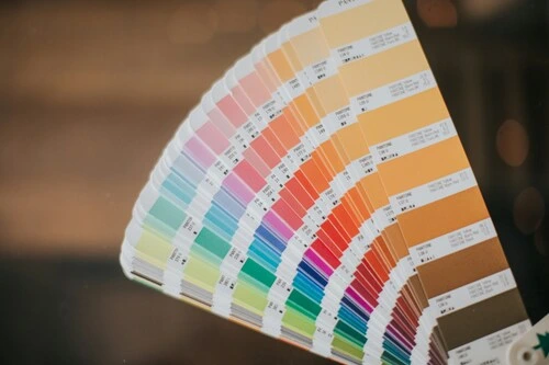
Choose a restrained palette, readable typefaces and a consistent approach to photography, illustrations and icons. Document practical usage rules rather than relying on subjective descriptions such as "modern" or "innovative".
A useful starter system includes two or three core colours, accessible text and background combinations, one or two font families with clear heading and body-text styles, and consistent icon and image treatments. Test colour contrast and avoid conveying important distinctions through colour alone.
Example: if a project dashboard distinguishes completed, ongoing and delayed activities, combine colour with text labels or symbols so the status remains understandable in grayscale or to users with colour-vision differences.
Use authentic project imagery when appropriate and obtain the necessary permissions. Keep image credits, usage rights and consent records alongside the files. For photographs of people, assess privacy and data-protection requirements before publication.
How do you comply with EU visibility rules without confusing the two identities?
Display the official EU emblem and the applicable funding statement prominently and separately from the project logo. The emblem acknowledges the funding source; the project logo identifies the project. Neither replaces the other.
Article 17 of the Horizon Europe Model Grant Agreement requires communication and dissemination activities to acknowledge EU support, subject to the grant's specific terms. Use the prescribed "Funded by the European Union" or "Co-funded by the European Union" statement as applicable, alongside the emblem. Include the disclaimer required by the GA on relevant materials, using the wording applicable to your grant. Do not substitute the European Commission's institutional logo for the EU emblem.
The EU emblem should not be altered or merged with other graphic elements. Where other logos appear, follow the Commission's prominence and sizing rules. Download approved artwork rather than recreating it from scratch.
Practical application: reserve a clearly defined acknowledgement area in presentation, report, poster and website templates. Check that the emblem, statement and disclaimer remain legible when exported, printed or viewed on mobile. The correct placement depends on the medium; a footer is not automatically sufficient if it makes the acknowledgement too small to read.
Official references: European Commission - Communicating and raising EU visibility; Horizon Europe Model Grant Agreement; EU emblem operational guidelines.
Which templates should the consortium receive?
Provide editable templates for the formats partners will actually produce, with approved identity assets and EU acknowledgement elements already in place. A compact, usable toolkit is more effective than a large collection of files nobody adopts.
Useful assets include:
- Presentation: title, content and closing slides; logo and EU acknowledgement area.
- Report or deliverable: cover, headings, tables, figure captions and acknowledgement text.
- Poster or event banner: scalable layout, partner logos and readable funding statement.
- Social media graphic: adaptable dimensions, text-safe areas and guidance for accompanying acknowledgement.
- Website components: logo variants, accessible colours, image rules and visible funding acknowledgement.
- Style guide: approved files, spacing, minimum sizes, colour codes, typography and contact person.
Example: if ten beneficiaries each prepare their own slide deck, a common template prevents ten incompatible logo treatments and reduces the communication lead's review workload. Templates should remain adaptable to different languages and audiences.
A project does not automatically need a dedicated website or accounts on every social platform. Select channels based on the communication plan, target audiences and the commitments in Annex 1 of the GA. For the broader channel strategy, see How Do You Build an Effective Communication Strategy for a Horizon Europe Project?.
How can you make the visual identity accessible and inclusive?
Build accessibility into the initial design system: readable text, sufficient contrast, meaningful alternative text, captions for videos and layouts that work on mobile and at enlarged text sizes. Avoid using decorative complexity where it makes scientific information harder to understand.
Example: a diagram of a multi-partner workflow should have a descriptive caption and a text explanation of the sequence, rather than depending entirely on coloured arrows. Check that fonts support all languages the consortium expects to use.
Accessibility checks should be applied to finished outputs as well as the template: a compliant slide master cannot prevent a partner from inserting an unreadable chart.
Who should approve and maintain the visual identity?
Assign one communication lead to manage the master files, version history, permissions and quality checks, while allowing partners to adapt approved templates for local activities. Agree on the approval process early, especially for materials with public-facing scientific claims.
A practical workflow is: the communication lead prepares two or three directions; consortium representatives review them against the brief; the agreed identity is tested in real templates; the final toolkit is distributed from one shared location; and updates are communicated to all beneficiaries.
Keep editable source files and a short "do and don't" guide. If a partner needs a new format, update the shared toolkit rather than creating an isolated design that other partners cannot reuse.
How can you tell whether the visual identity is working?
Assess whether partners use the approved assets consistently, audiences can recognise the project across channels, and materials remain readable and compliant. Do not treat attractive design or social-media impressions as proof of scientific or societal impact.
Useful internal checks include the proportion of sampled materials using the current template, the number of corrections required before publication, recognition in a small stakeholder survey, and accessibility issues identified during review. These are suggested management indicators, not mandatory Horizon Europe key performance indicators.
Illustrative example: review 20 recent public-facing outputs each quarter. Record whether they use the current project identity, correct EU acknowledgement, readable typography and approved scientific messaging. Use the findings to improve the templates and partner guidance rather than merely reporting a compliance percentage.
What should happen to the visual identity after the project ends?
Archive the approved artwork, editable templates, usage rights and documentation, and agree who may maintain project communication channels and reuse the identity after the funding period. Ensure that any continuing communication accurately distinguishes completed project work from new activities.
For example, if the consortium's research platform continues after the project, its maintainers may retain the project identity while updating the website to explain who now operates the service and what the original EU funding supported. The funding acknowledgement should not imply that later, separately financed activities are covered by the original grant.
Conclusion: What is the practical route to a coherent project identity?
Start with the audience and project message, build a simple adaptable design system, integrate the official EU acknowledgement correctly, and distribute templates that partners can use without specialist design support. Review real outputs and update the toolkit when problems emerge. The aim is not to make every project look like a commercial brand: it is to make its work recognisable, understandable and consistently presented throughout and beyond the grant.
About the author
Julien Sudre - Horizon Europe grant writing, project management and communication specialist
Julien Sudre works on Horizon Europe proposal development and the management and communication of collaborative research and innovation projects. Through Grant 360, he develops practical resources for teams preparing and implementing EU-funded projects.